Case study
Prestidge Beauté
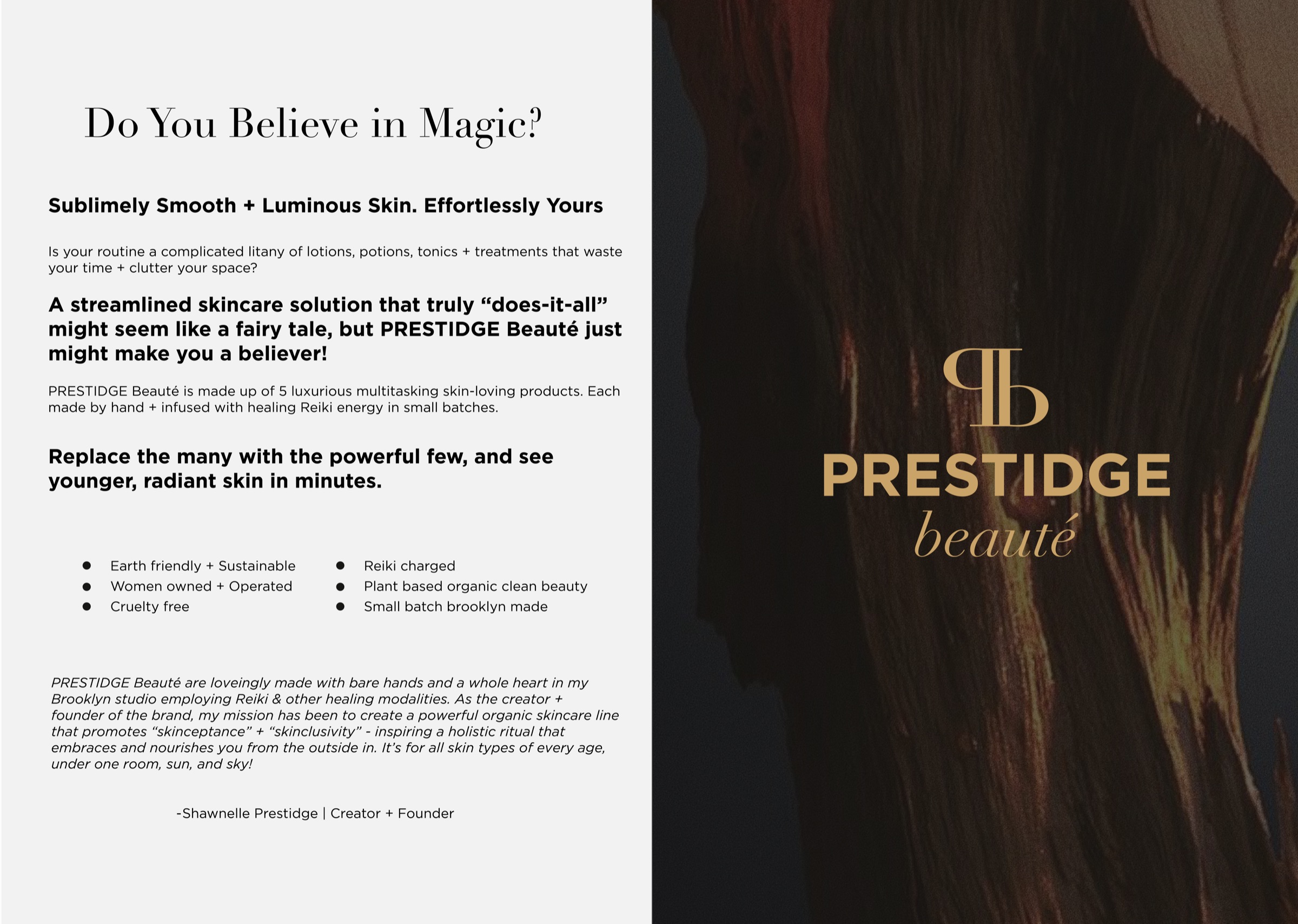
Meticulously handcrafted in Brooklyn with a deep sense of purpose and gratitude. Infused with Reiki and other sacred modalities with a mission to curate a superlative range that transcends conventional beauty standards.
Belief
We believe that simplicity is the ultimate luxury, alchemizing products that intentionally infuse time into daily life by delivering transformative multifaceted benefits in each of our offerings.
Philosophy
We tread lightly upon the earth, striving to minimize waste and excess in every aspect of our production process.
Commitment
Belief in high vibrational beauty—harnessing the innate energy of nature to infuse our elixirs with healing properties that nurture and protect the skin.
Promise
Our goal is not merely to sell skincare products but to inspire a transformative journey towards radiant living in harmonious alignment with the world around us.
Meticulously handcrafted in Brooklyn with a deep sense of purpose and gratitude. Infused with Reiki and other sacred modalities with a mission to curate a superlative range that transcends conventional beauty standards.
Sustainability1
We prioritize sustainability by minimizing waste and excess in every step of our production. Our focus on product efficacy encourages a minimalist skincare philosophy, valuing quality over quantity.

Organic2
At our core, we celebrate the fusion of the world’s finest antioxidant-rich, organic plant botanicals, seamlessly woven together with the transformative power of Reiki. Our mission is to nourish not only your skin but also your spirit with this harmonious blend.

Clean Ingredients3
Our dedication surpasses mere product development; it’s a pledge to uphold an elevated standard of beauty. Our formulations are tested on luminaries of the entertainment industry, models, and respected peers, never on animals we cherish. Crafted thoughtfully in our Brooklyn sanctuary, we combine the finest grade organic, wild-harvested, and consciously sourced natural ingredients from dedicated growers worldwide.
To define the fundamentals of the visual suite for Prestidge Beauté, we utilize the core values as a corner stone for the brand identity.

Beauty from
the Outside In
Informed by our multi-dimensional approach to skincare, we have developed the brand slogan, “Beauty From the Outside In”.
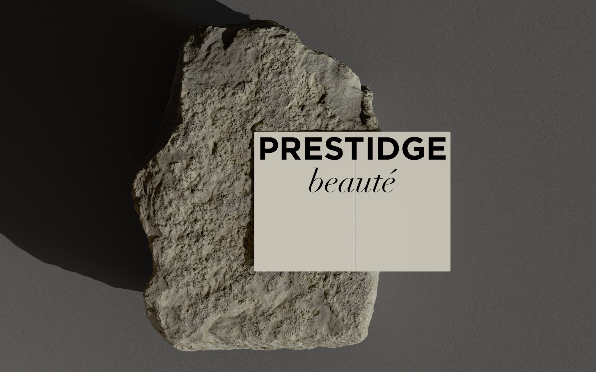
The logo of PRESTIDGE Beauté showcases diversity through its transition from a modified traditional serif font called Granjon Roman (the font Gucci uses for their logo) to a modern italic type called Larken, symbolizing uniqueness and beauty in individuality. The typography of the logo incorporates various font styles, yet it evolves with distinct visual contrasts in its ascenders and heights visualizing the transformative power of the brand’s elixirs.



The Brand Mark is a reflection of the brand’s dedication to conscious living and its goal to inspire a transformative journey towards radiant living in harmonious alignment with the world around us.
Charcoal & Classic Gold
PRESTIDGE Beauté’s branding uses Classic Gold and Rosehip to deliver a soft neutral image. In addition, we used Midnight to express a refined image. Each color is expanded freely according to the image of the each product or model.
ABCDEFGHIJKLMN
OPQRSTUVWXYZ
abcdefghijklmn
opqrstuvwxyz
0123456789?!
Regular
Italic
ABCDEFGHIJKLMN
OPQRSTUVWXYZ
abcdefghijklmn
opqrstuvwxyz
0123456789?!
Light
Regular
Oblique
Bold
Beauty from the Outside InBeauty from the Outside In
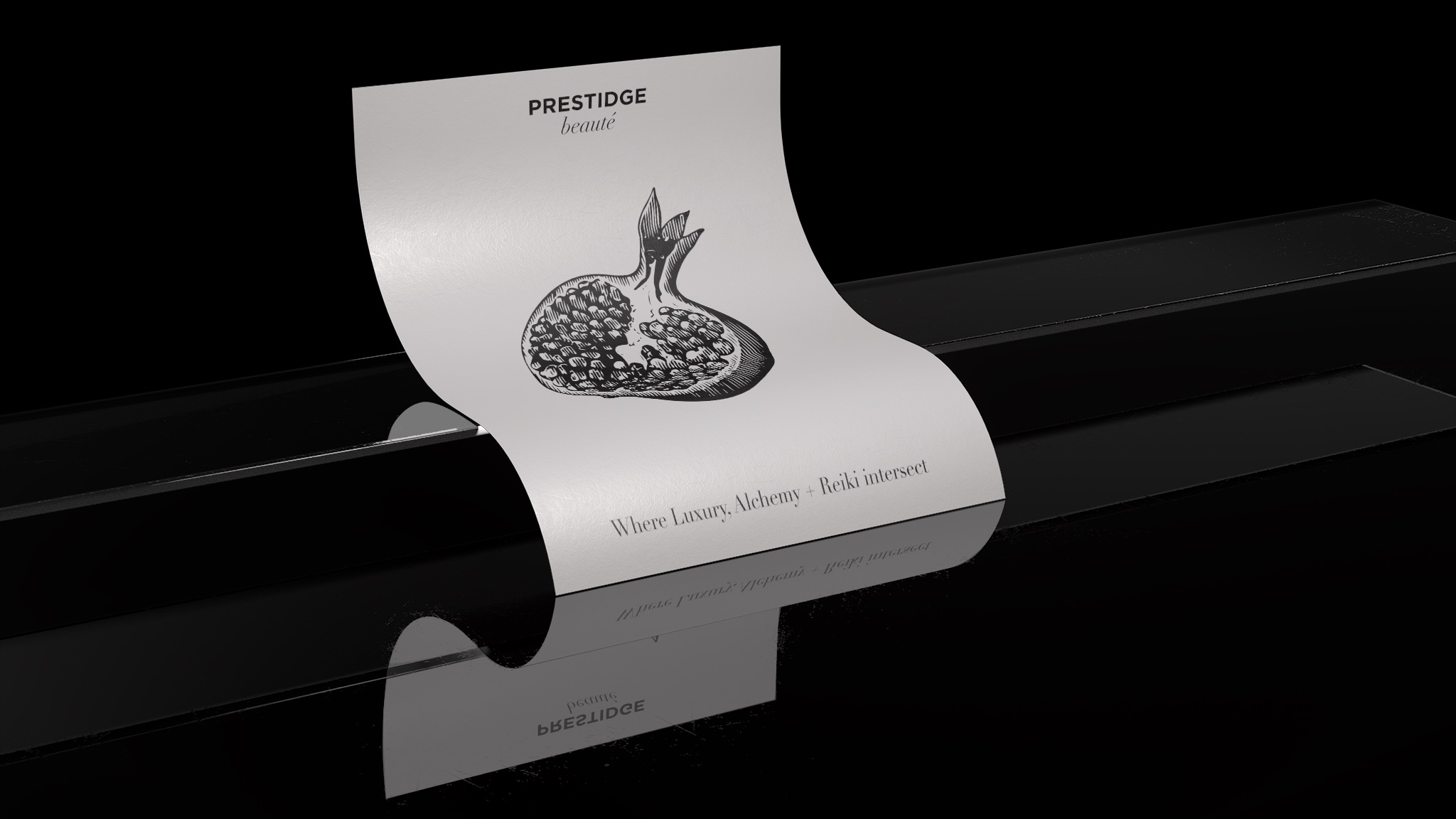

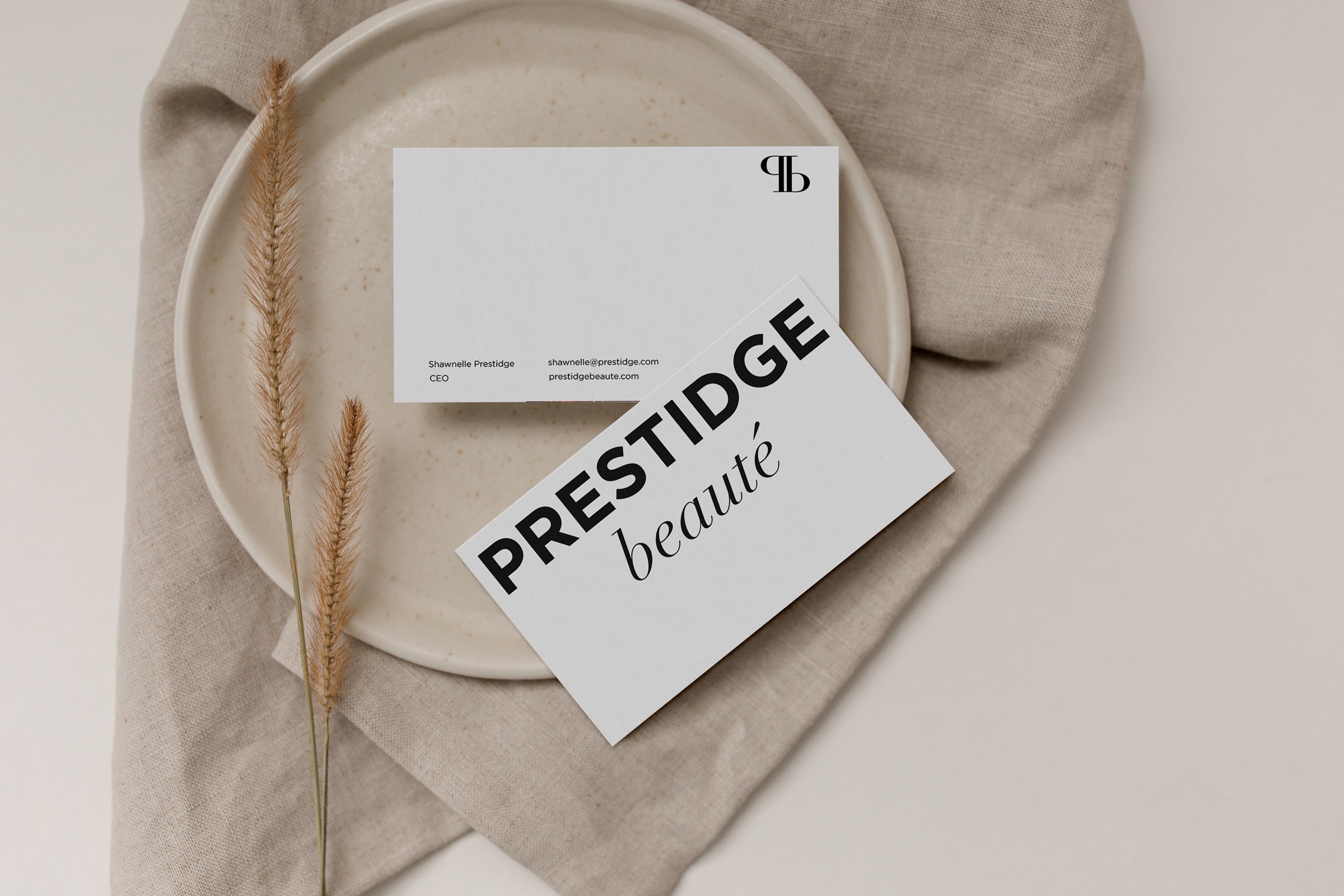
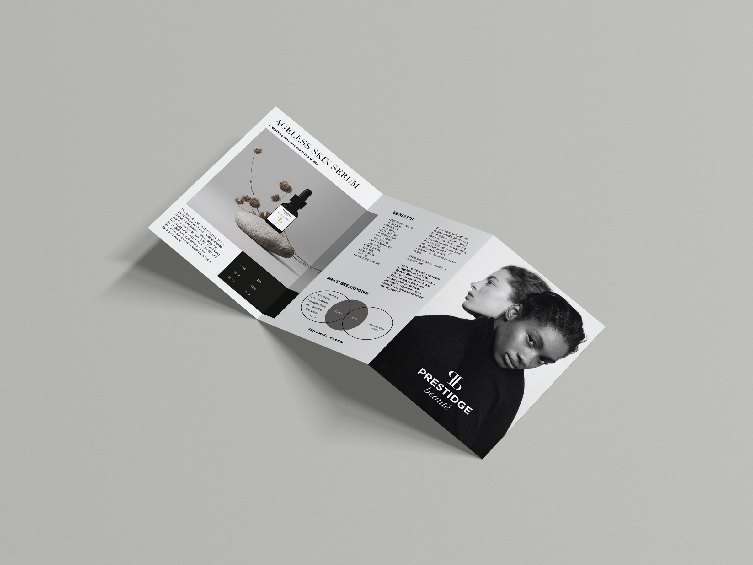
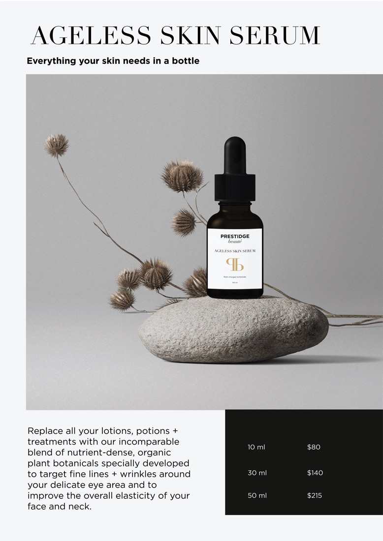
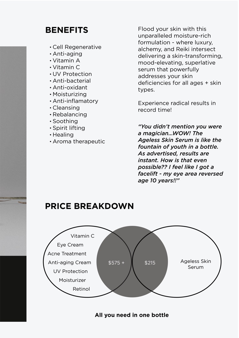

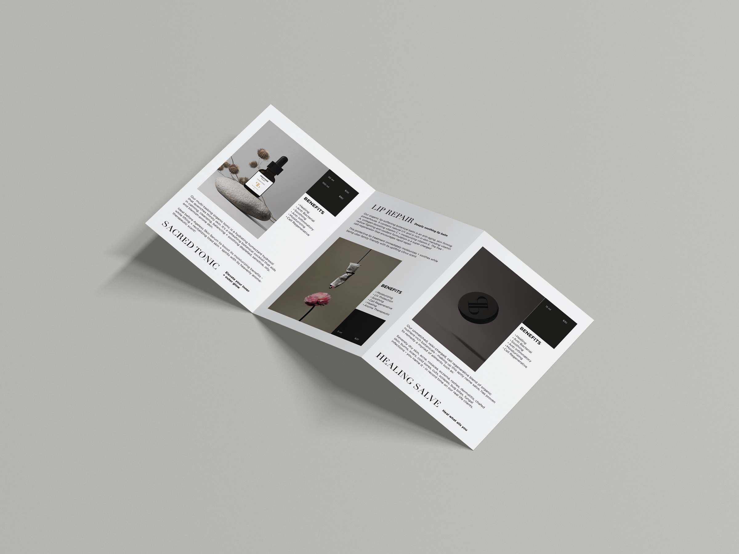
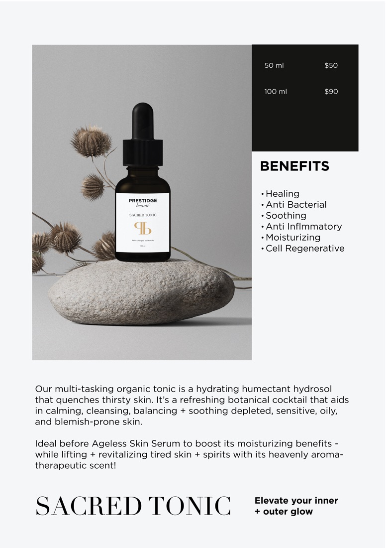
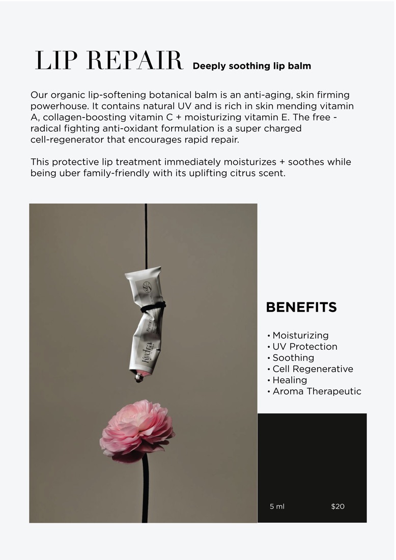
The typeface employed by PRESTIDGE Beauté utilizes Instrument Serif, a serif that embodies the traditional methods integral to our production heritage. Helvetica offers versatile application across various media platforms, thanks to its straightforwardness and readability. Even in the confined space of packaging, it effectively presents extensive information in a clear and legible manner.

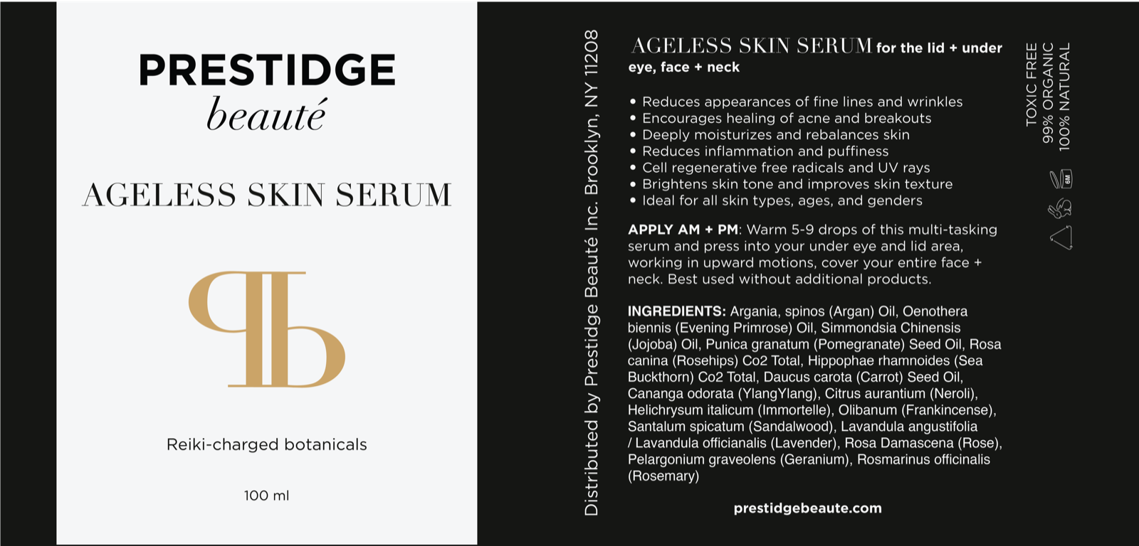

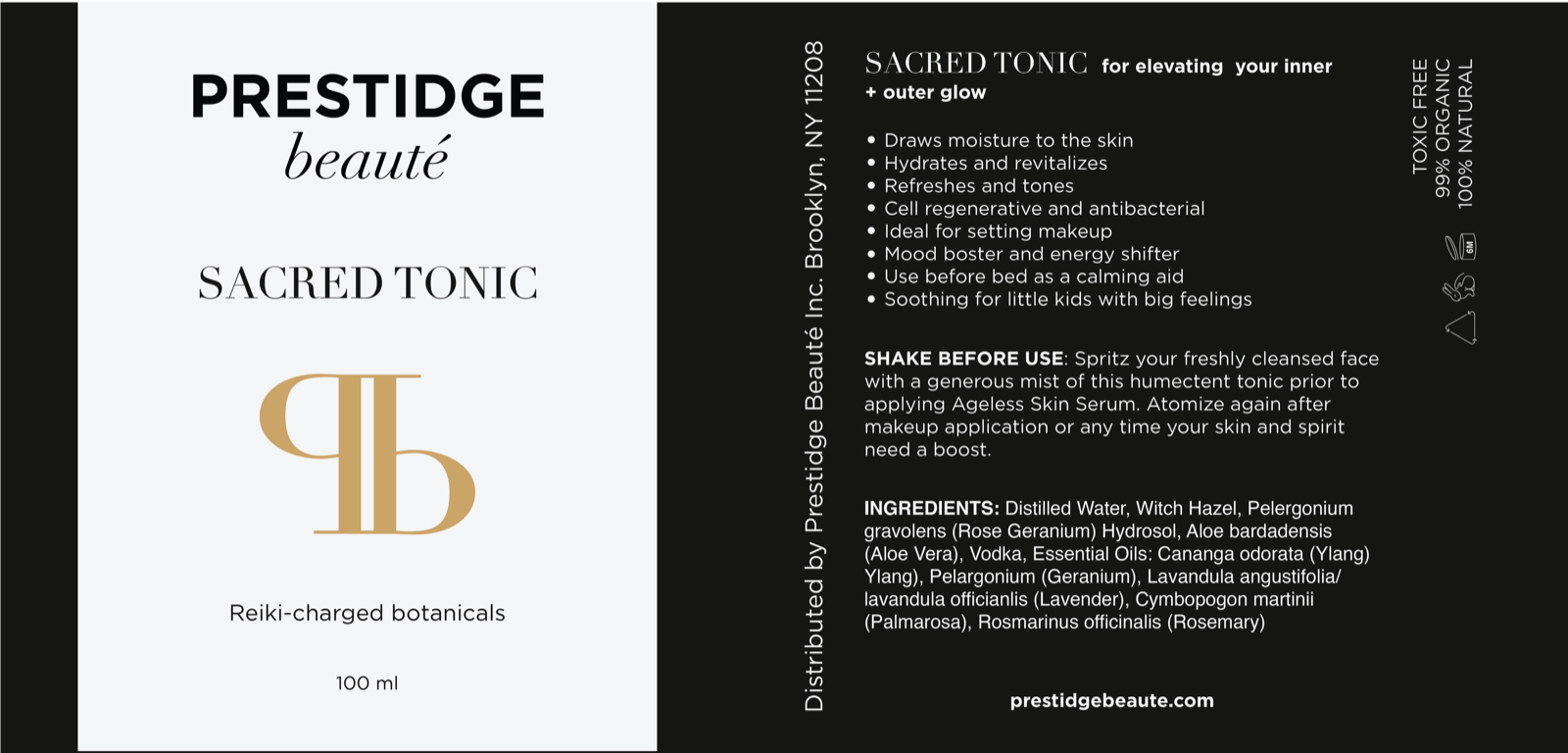

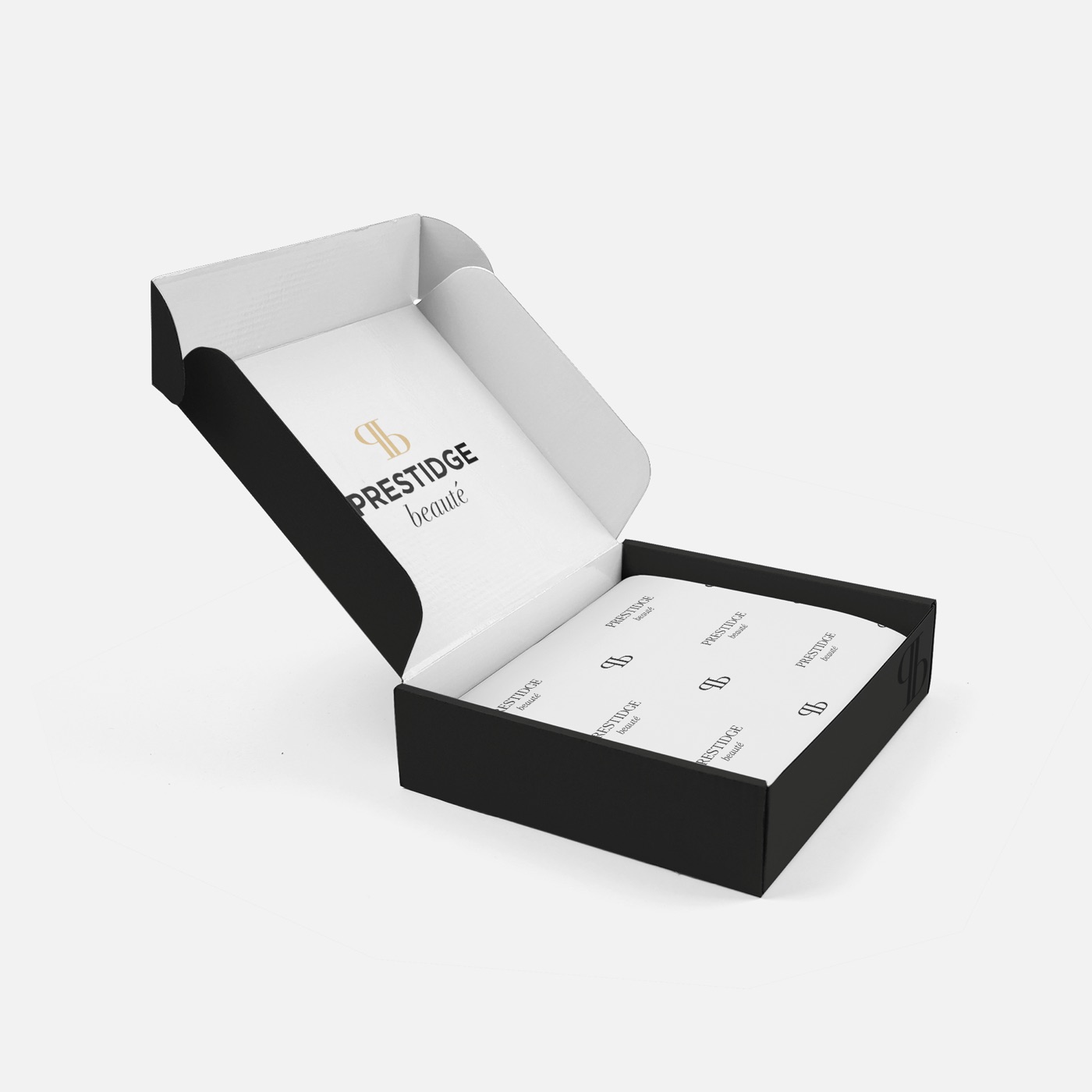
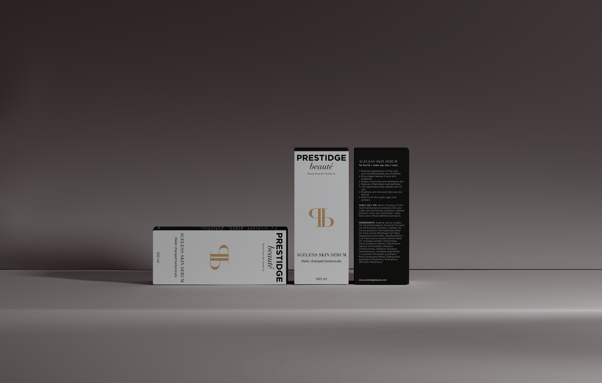
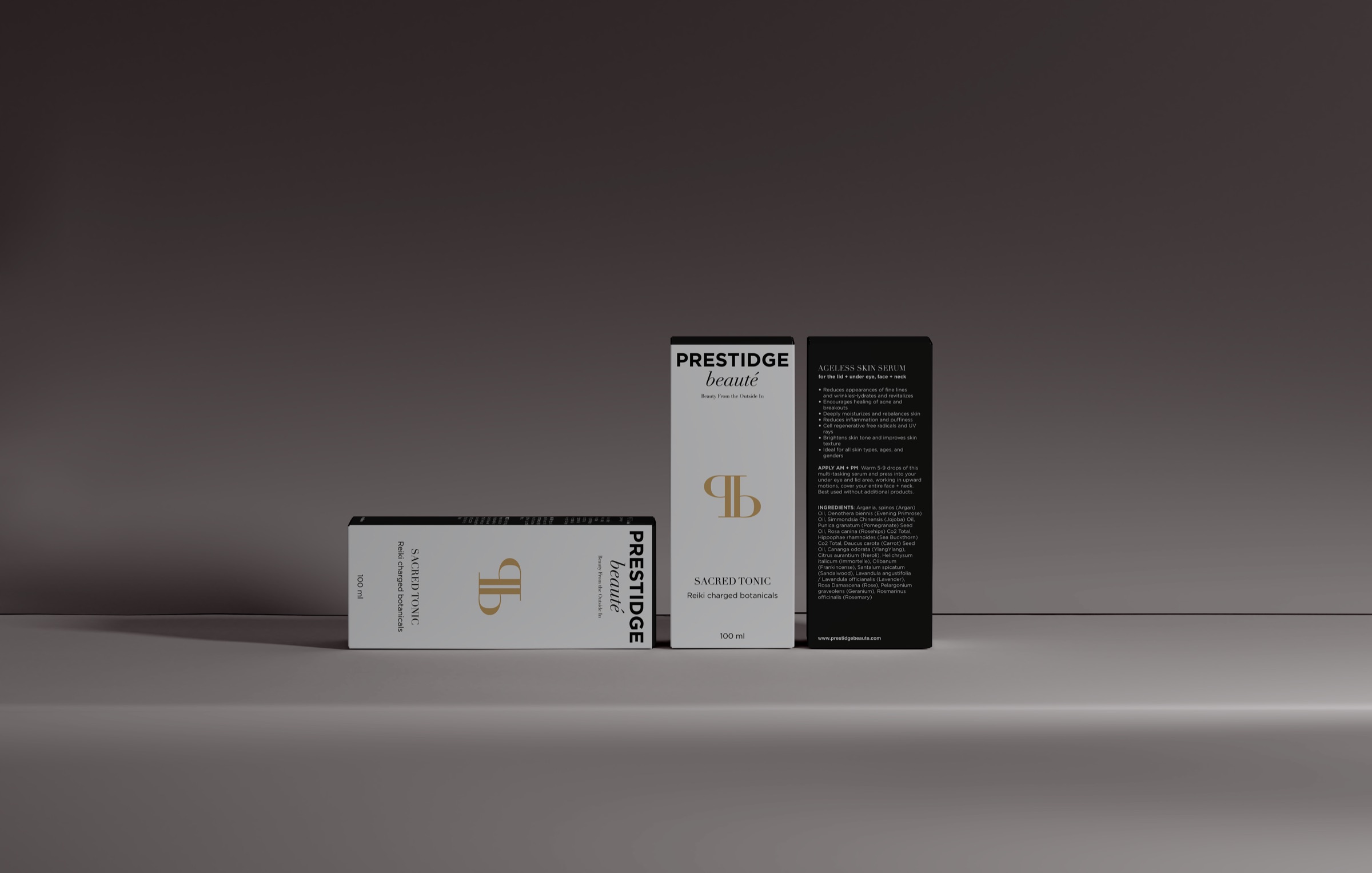
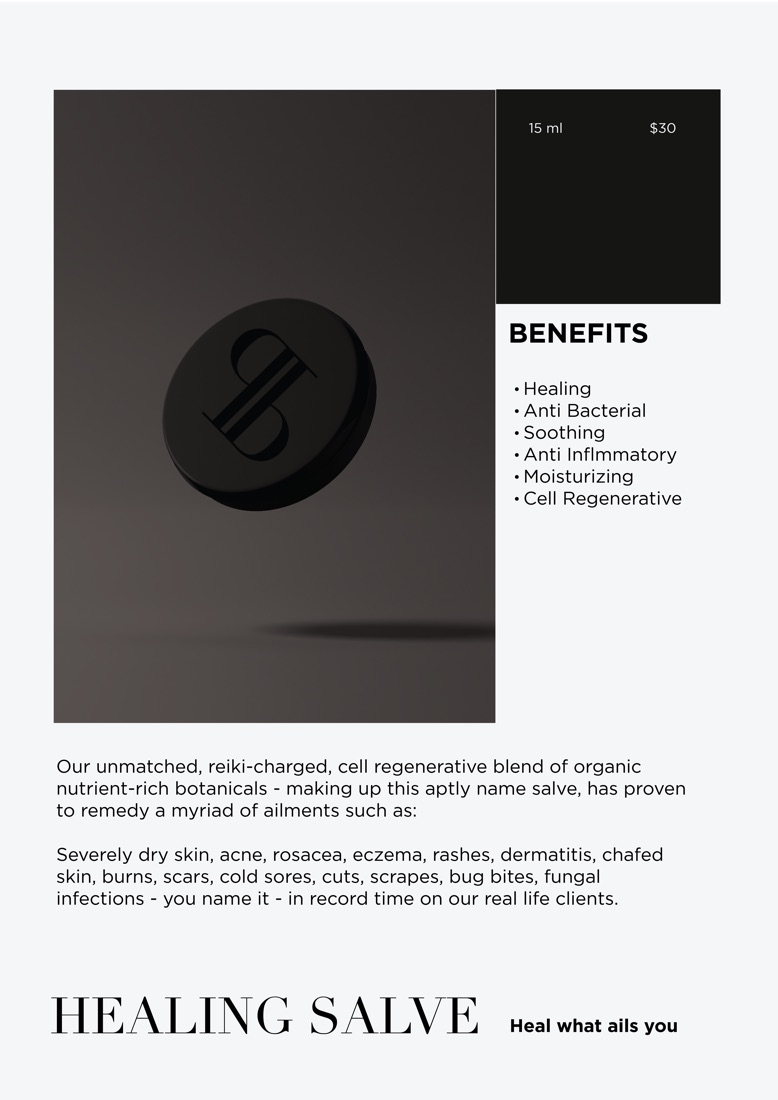
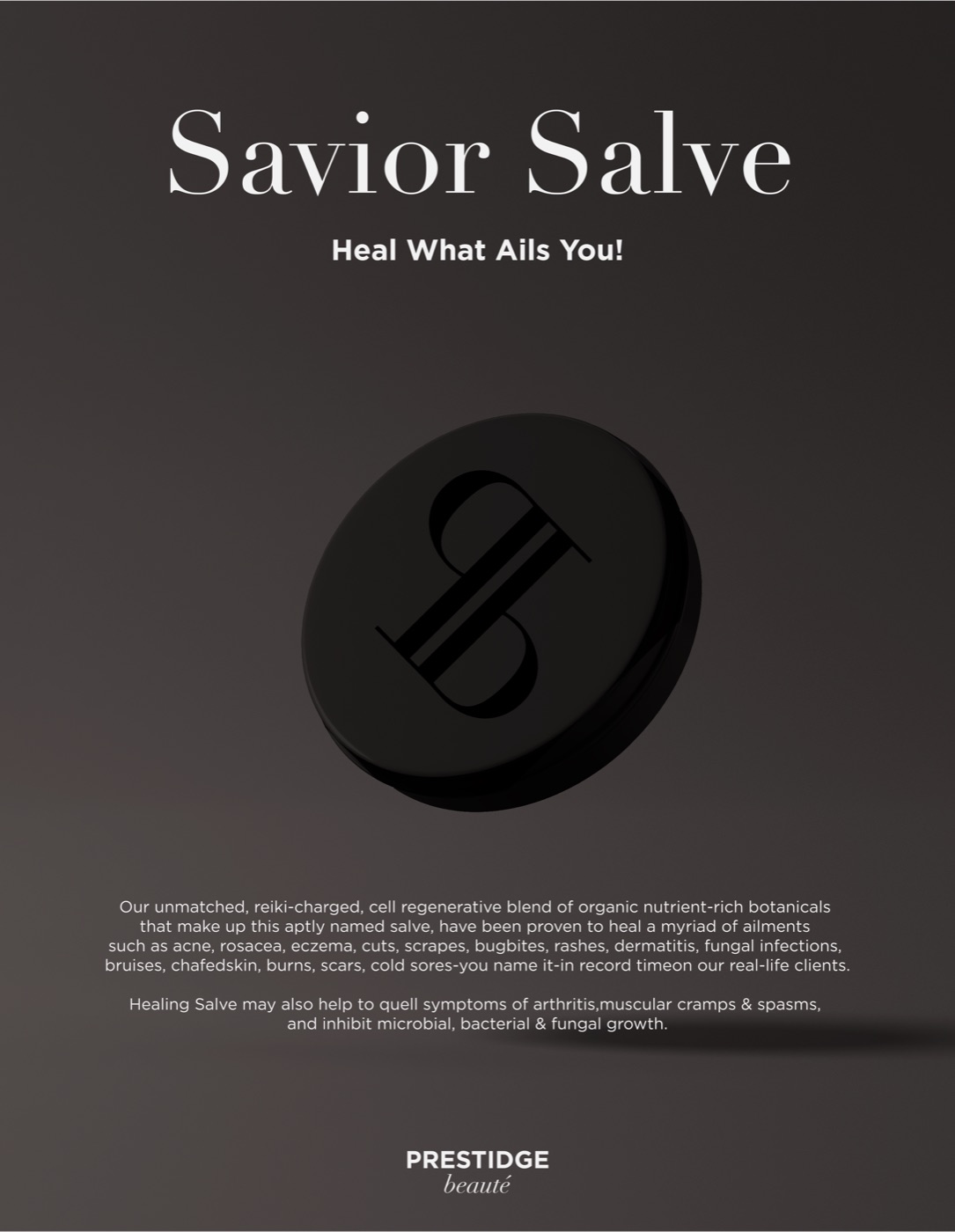
The packaging of PRESTIDGE Beauté features sleek & simplistic designs that effortlessly convey the brand’s essence. Grounded in sophistication, it conveys the brand’s identity while also offering diverse and unique experiences to each consumer.
Daghang Salamat