Ancient spiritual medicine for modern dis-ease.
After a careful review of the brand strategy, this visual direction has been established to encapsulate Opening the Eyes of the Heart’s core and to resonate with the brand’s target audience. The objective is to translate the brand’s core to use ancient spiritual medicine for modern day concerns.
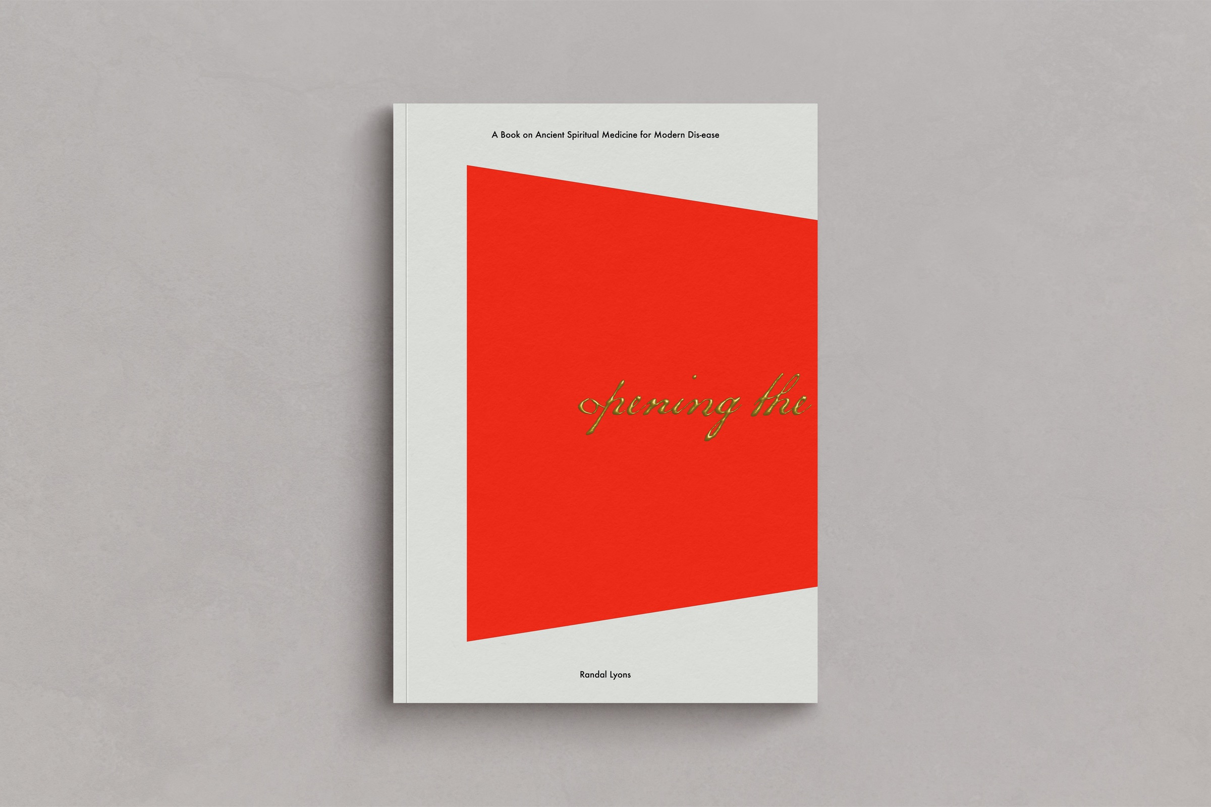
The branding concept begins with a script, calligraphic type to best visually represent brand’s unique approach to empowered healing where one journeys using a map provided by Chinese Medicine to venture into the realms of spirit and return with specific knowledge, information and power that directly relates to our personal health concerns.
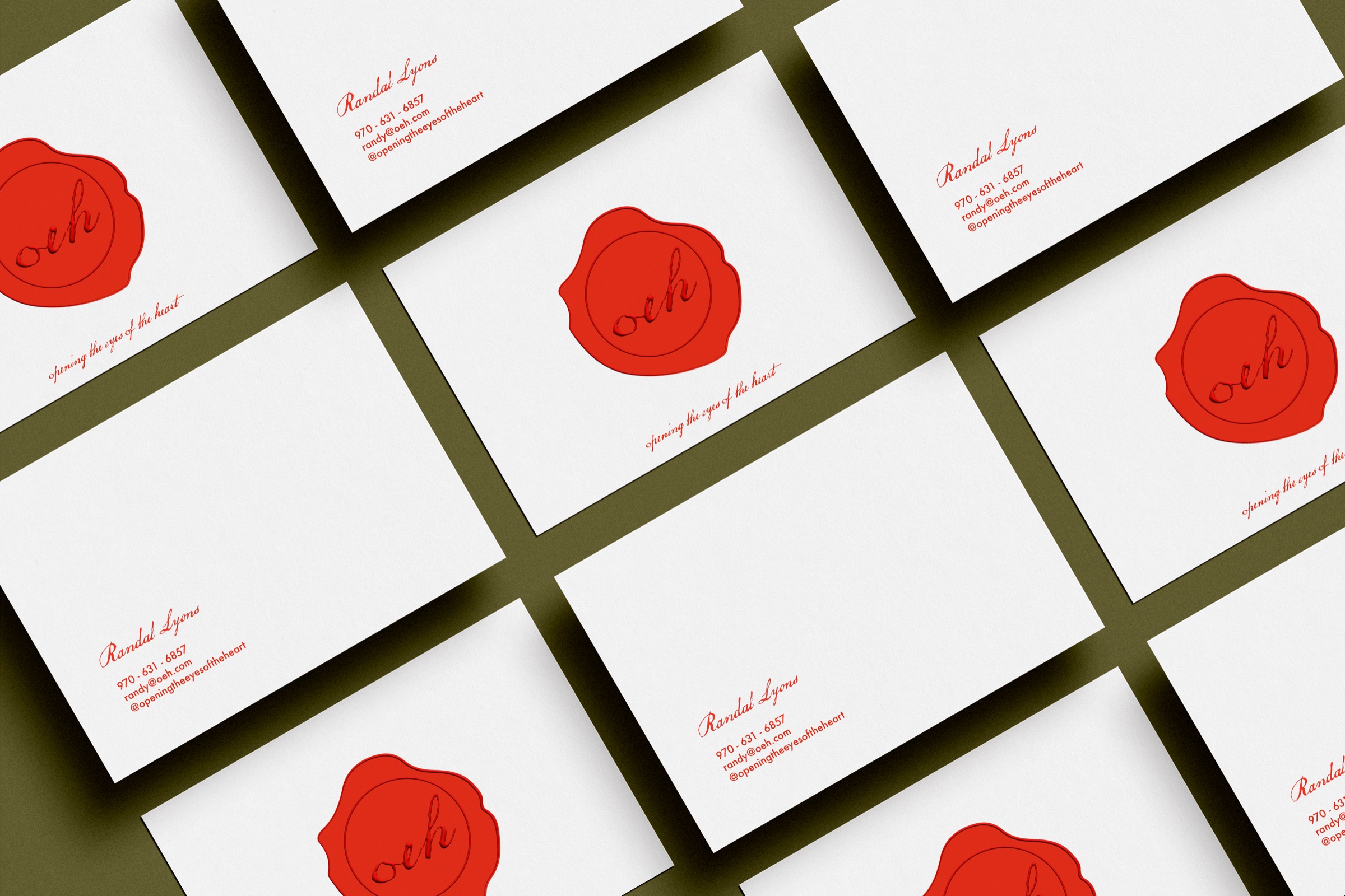
Furthermore, this was simplified into brand marks with the goal of responsiveness to accommodate spaces in need for visual representations of the brand in any dimensions/orientation. “The Magician” and “The Sage” helped in solidifying the whole concept.
- lack of restriction; accessibility.
- lack of secrecy or concealment; frankness.
- a feeling that makes one self-conscious and unable to act in a relaxed and natural way.
- a voluntary or involuntary restraint on the direct expression of an instinct.
- the action of inhibiting, restricting, or hindering a process.
- the slowing or prevention of a process, reaction, or function by a particular substance.
Primary logo. Inspired by the idea of beginnings, we chose a typeface that is human in its strokes. Like that of a journeyer writing a note before venturing off. The use of this font is also strategic to encourage relational engagement with the brand by making sure that is easy to read.
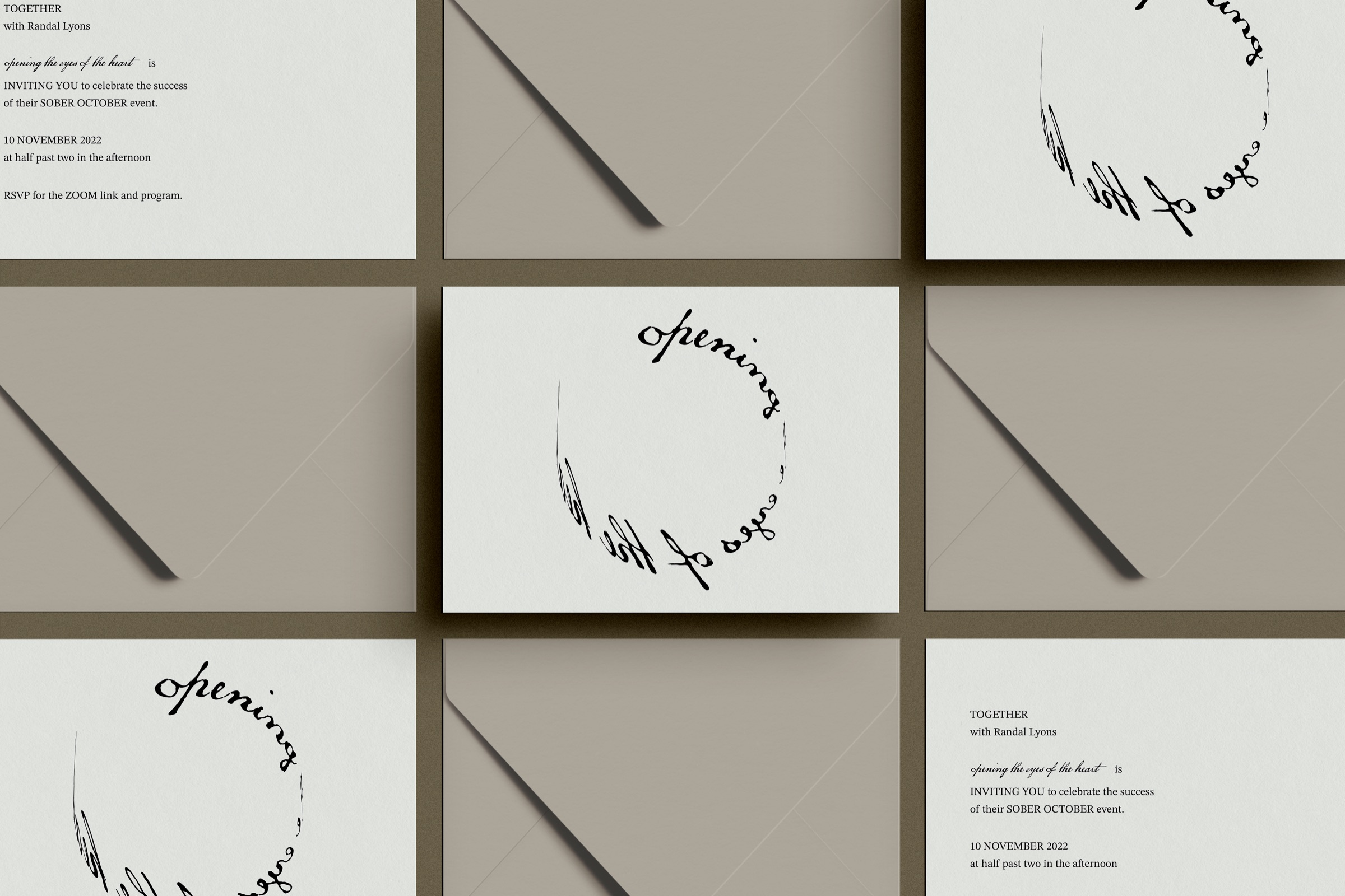
Secondary logo. Staying true to the goal of having a responsive branding identity, the primary logo was then arranged vertically to accommodate spaces that require a presentation that has a narrow digital real estate. This effort is a clear nod to the intrinsic nature of digital communication and globalism.
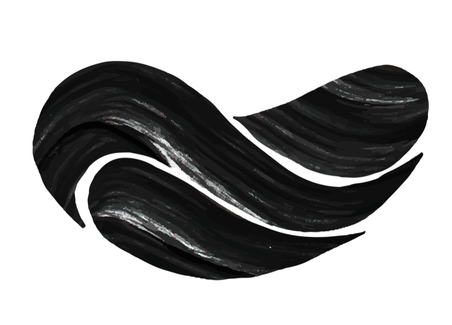
Water I: The Sacred Place of Union and the Origin of Fear
The Seven Journeys begins the process of Opening the Eyes of the Heart by entering the Chinese cycle of the Five Elements through the element of Water. Associated with the season of winter, Water is the time of dark, quiet stillness that occurs after autumn’s death and before spring’s birth. It is the mysterious phase in the cycle of life that simultaneously causes the reasons for and provides the answers to one’s deepest questions.
Because of this duplicitous power that lies within the unknown, it is here where one can find and examine the foundations of their most primal beliefs. So, it is only fitting that this is the element where one begins to examine the murky shadows of their unknown.
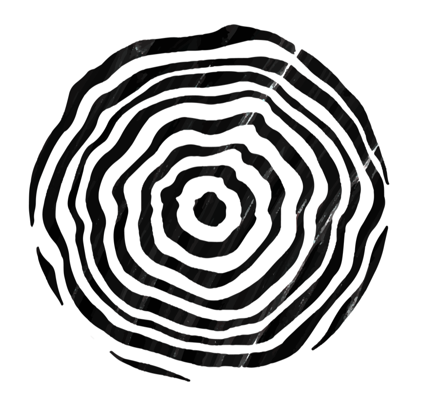
Wood: Movement as Medicine
Wood is the element providing the creativity needed to begin the materialization of our dreams. Receiving Water’s beliefs, Wood points them into physical manifestation by deciding with unwavering decisiveness, the best direction to accomplish this task. It is the first and initial force. It is birth and the sound of a baby’s first shout. It is dawn and the universal possibility that emerges there. It is movement as medicine.
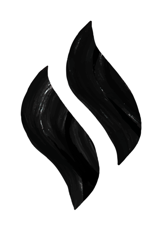
Fire I: The Emperor - Our Heart as Ruler
The Fire element is associated with the Heart, which is considered to be the ruler of all the organs. It attained this distinction because of two important reasons. The first is the obvious physiological aspect that if the Heart stops functioning, the whole body ceases to function. The second reason is that the Heart is considered to be the proper residing place of the mind.
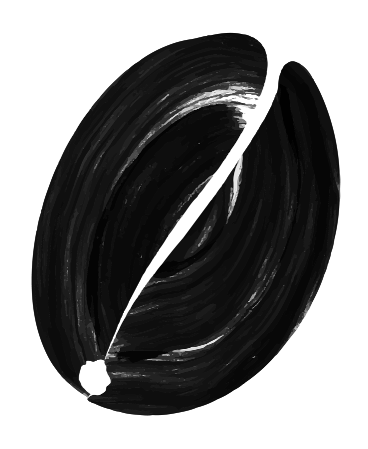
Earth: Transformation and Manifestation
“All things are connected. Whatever befalls the earth, befalls the sons and daughters of the earth. Man did not weave the web of life, he is merely a strand in it. Whatever he does to the web, he does to himself.”
- Chief Seattle
Metal: Giving and Receiving: Our Reception and Release
Wanting what we have, not coveting what we don’t, filling and emptying ourselves with whatever the cycle of the universe throws in our direction, along with the Heartfelt expressions of how all these things affect us, make up the nature of Metal. The balance here is to be achieved between a peaceful contentment and the striving for Passionate goals. This, and the thankfulness for our present position in life along with the awareness that it will always be changing, will also be a great influence upon our condition.
Water II: Family Lineage
One easy way to explain this is to review the life cycle of the Five Elements. Beginning with a person’s time in the womb (Water), he is soon born into this world (Wood), he grows, develops and eventually discovers the nature of his Heart (Fire), after working in this direction, he manifests these dreams and enjoys these fruits (Earth), he retires, declines and ultimately dies (Metal), but what carries on (Water)? There are particular aromas of memory that linger about. There are the ripples of affect that follow behind in the wake of one’s life. The next Water journeys will track these waves of influence by examining their relationship to the emotion of Sadness.
Fire II: Defending the Emperor
The first chapter on the element of Fire introduced the concept of the Heart as the Emperor. In this second chapter on the element of Fire, the Pericardium, or what is also called the Heart Protector (HP) will be examined in its role as the defender of the Emperor.
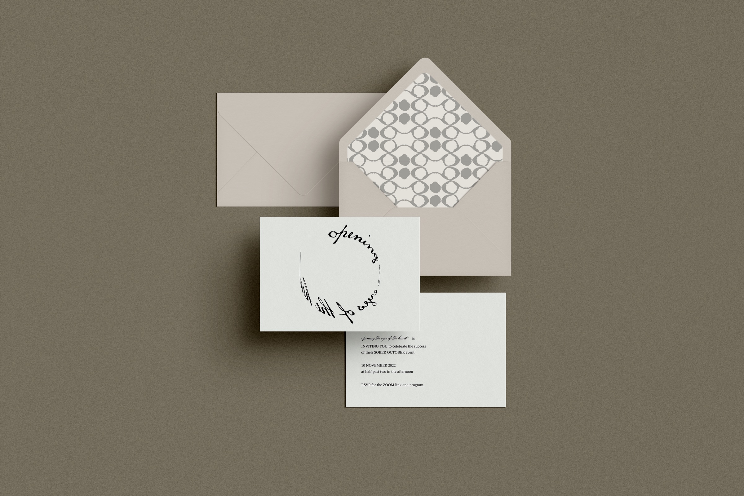
Pattern. To provide visual assets for any scenarios, we developed a pattern that is cohesive with the entire brand identity system using ‘Openness’ and ‘Inhibitions’ as the foundation. This pattern is inspired by a snake skin which is shed when they have outgrown the vessel that is housing them which is what engaging with the brand will feel like, growing out of old patterns, belief systems, etc.
Website
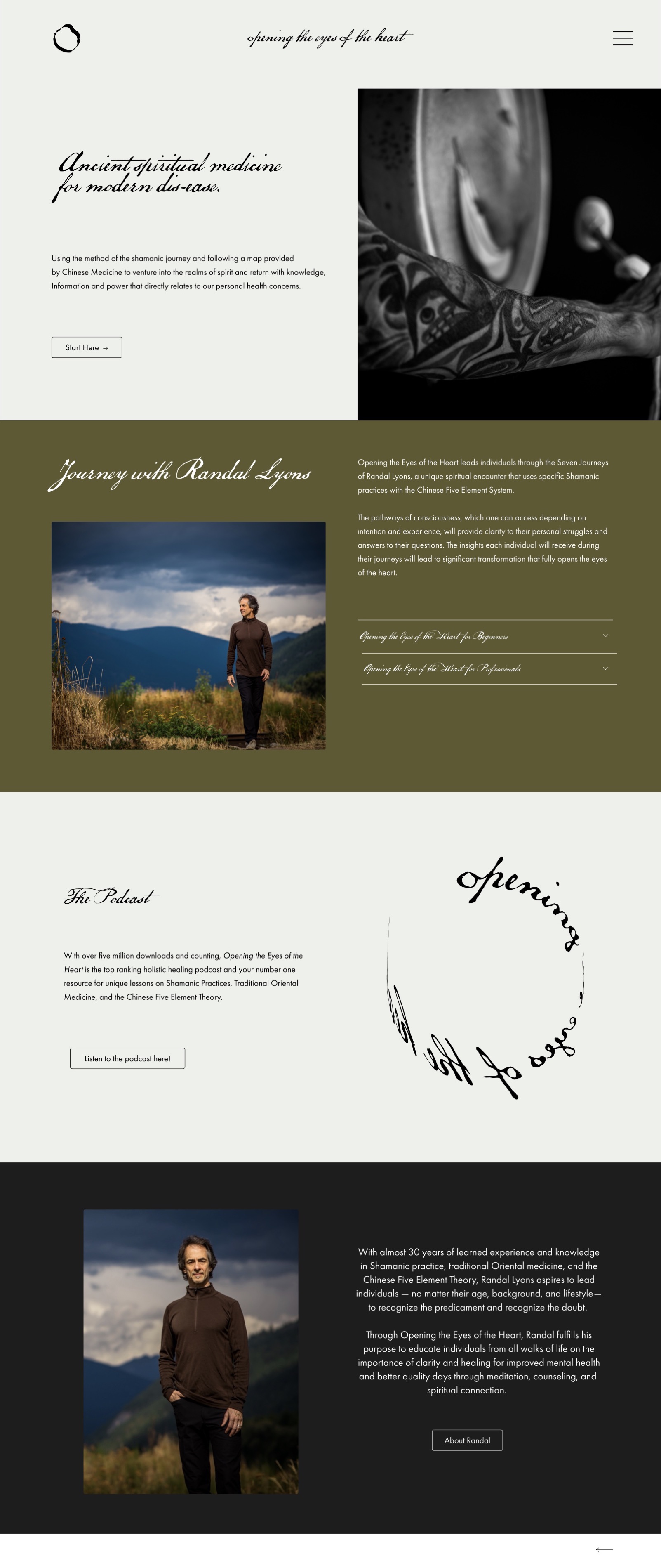
Ancient spiritual medicine for modern dis-ease.
Using the method of the shamanic journey and following a map provided by Chinese Medicine to venture into the realms of spirit and return with knowledge, information and power that directly relates to our personal health concerns.
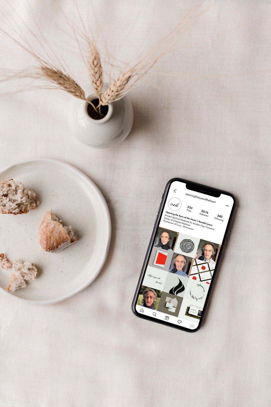
@openingtheeyesoftheheart
Ancient Spiritual Medicine for Modern Day Concerns
Doctor of Oriental Medicine
Practitioner of Core - Shamanism
Daghang Salamat!