Case study
Despuga
3. Core values

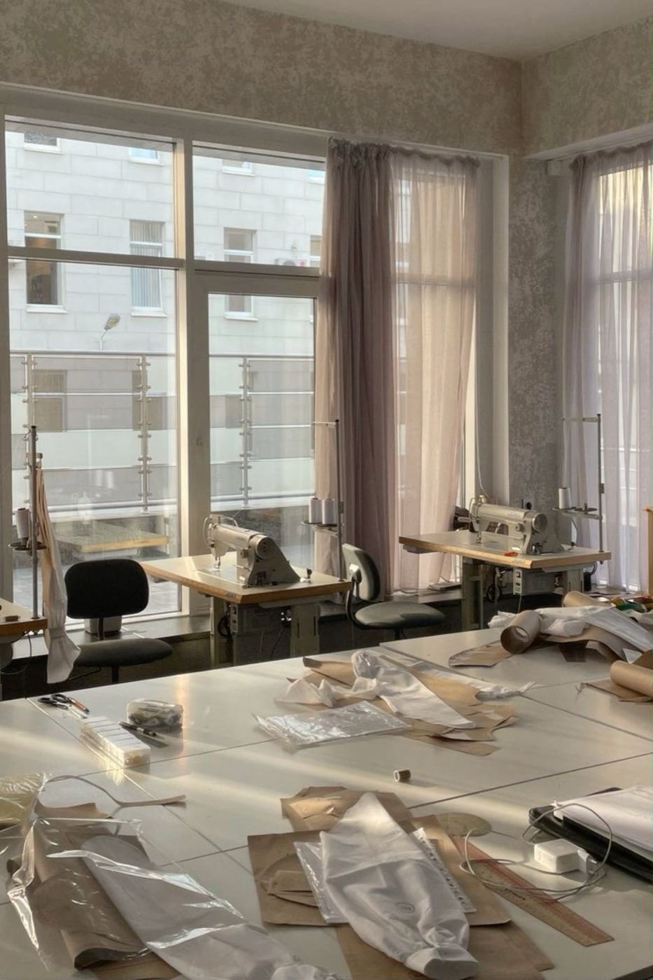

Quality
is not just a standard; it’s our commitment to excellence in every stitch, ensuring that each garment meets the highest standards of craftsmanship and durability.
Kalidad
Transparency
is the cornerstone of our relationship with our clients. We believe in open communication and honesty throughout the production process, providing clear insights into our methods and practices.
Klaridad
Community
is at the heart of Despuga. We foster a sense of belonging among our team, partners, and clients, ensuring that every interaction contributes positively to our shared community.
Komunidad
4. Brand essence
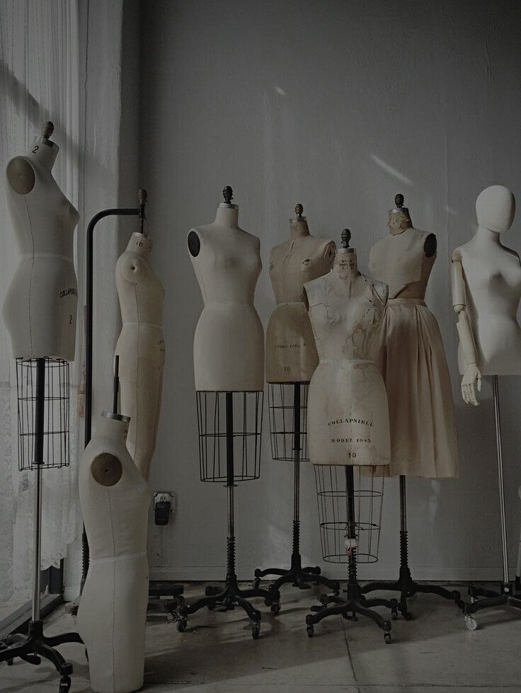
DPA represents Despuga’s commitment to Defining Premium Artisanship. It embodies our relentless pursuit of excellence, precision, and creative craftsmanship in every garment we produce. This acronym reflects our dedication to setting the highest standards in quality and delivering unparalleled value to our customers, reinforcing our position as a leader in the industry.
7. Brand logo
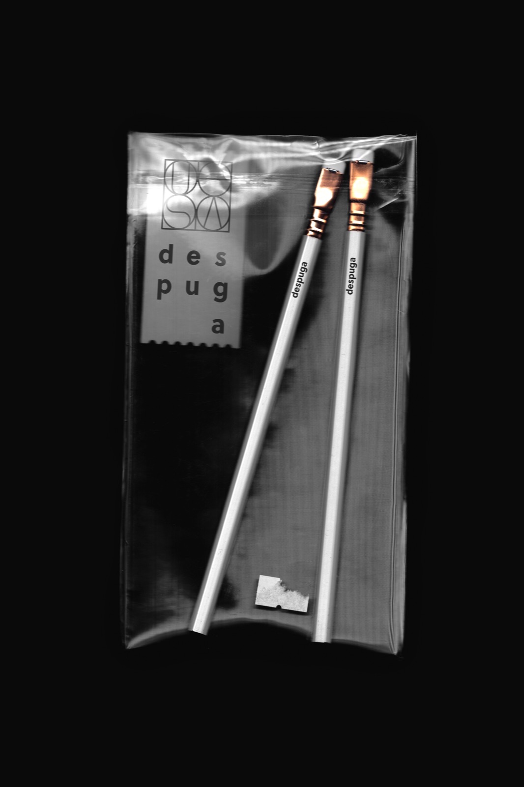
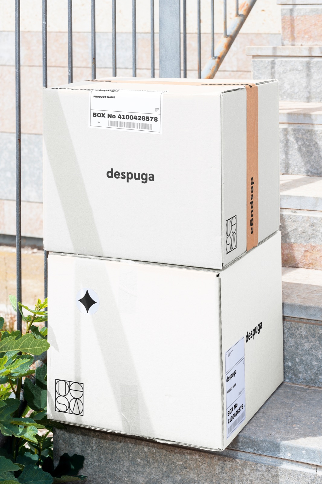
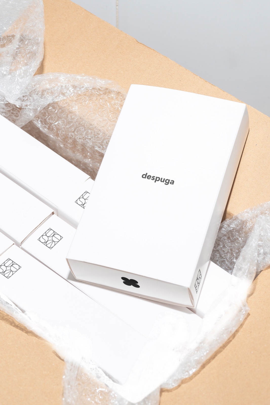
despuga

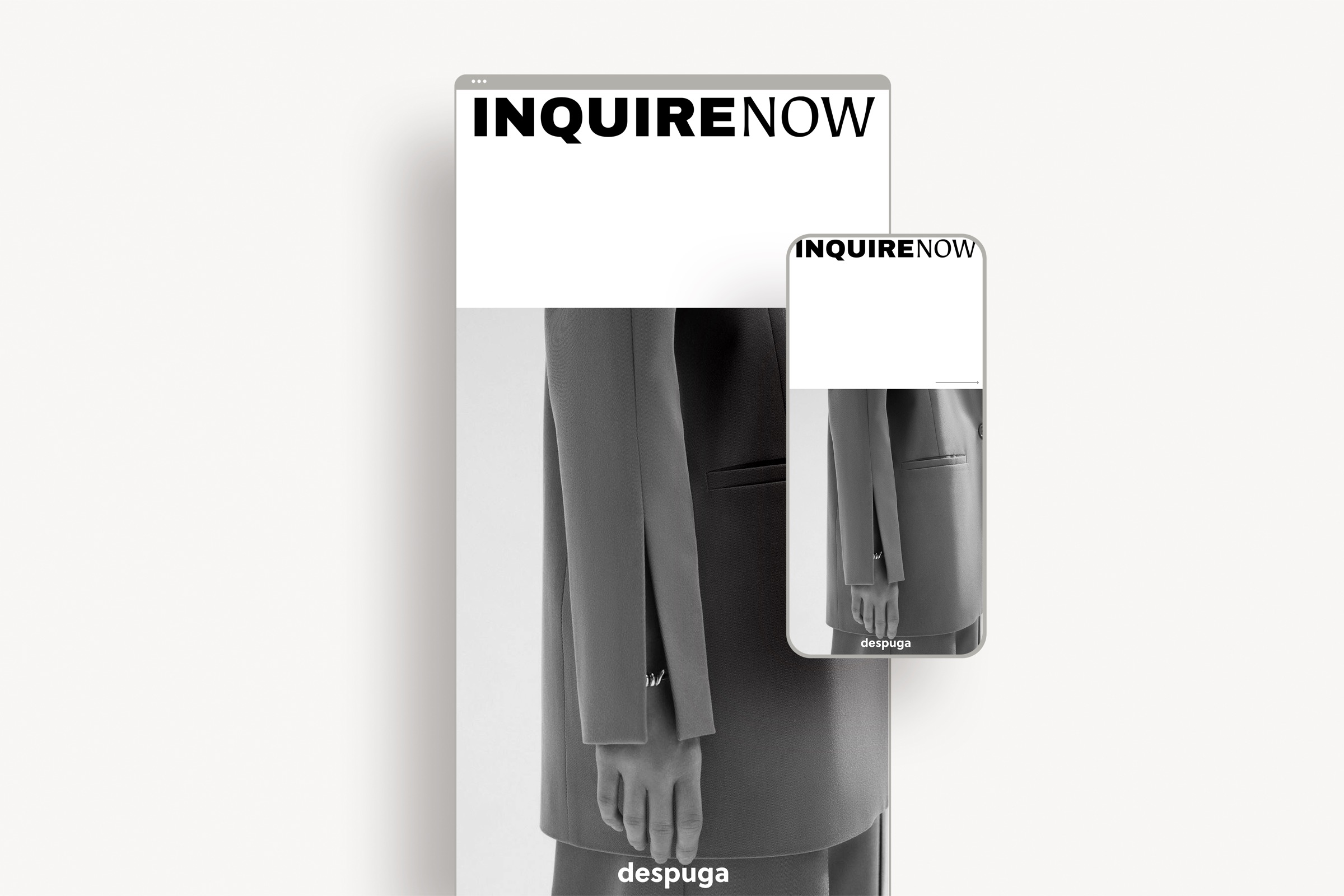
2. Clarity and Versatility:
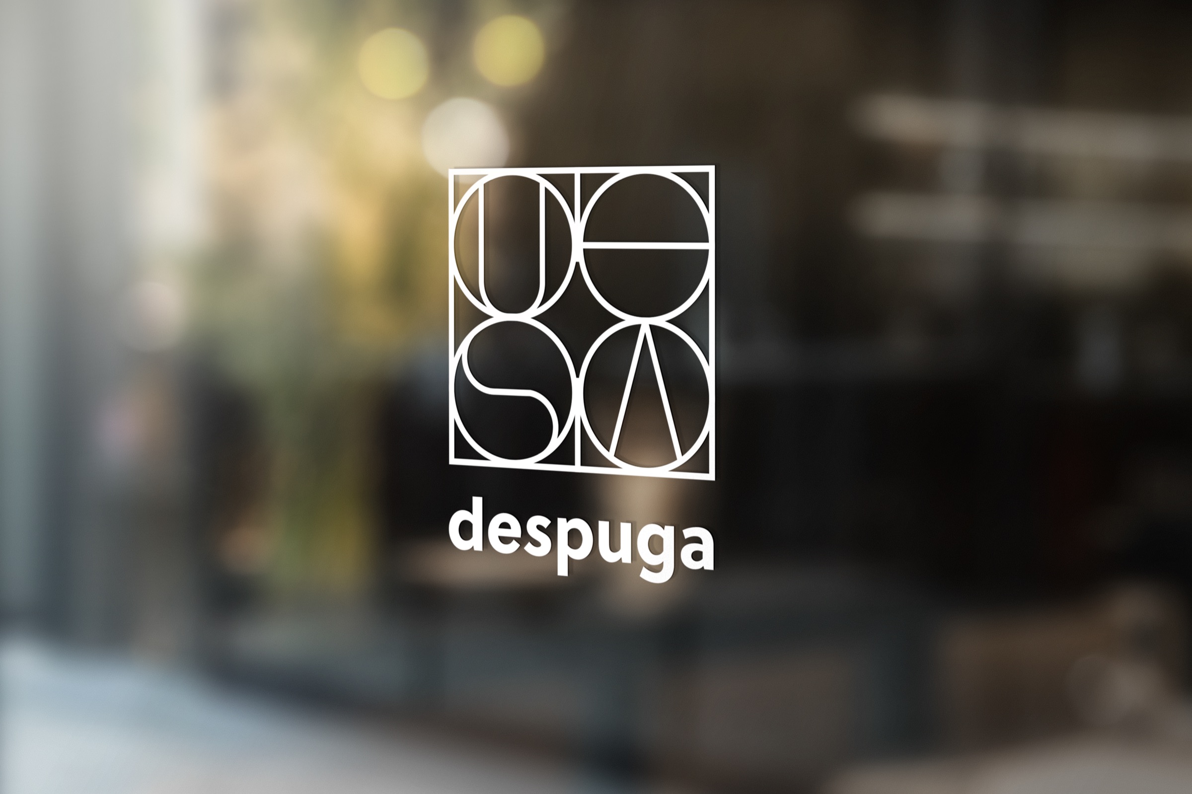
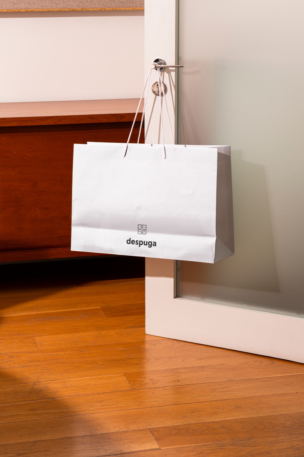
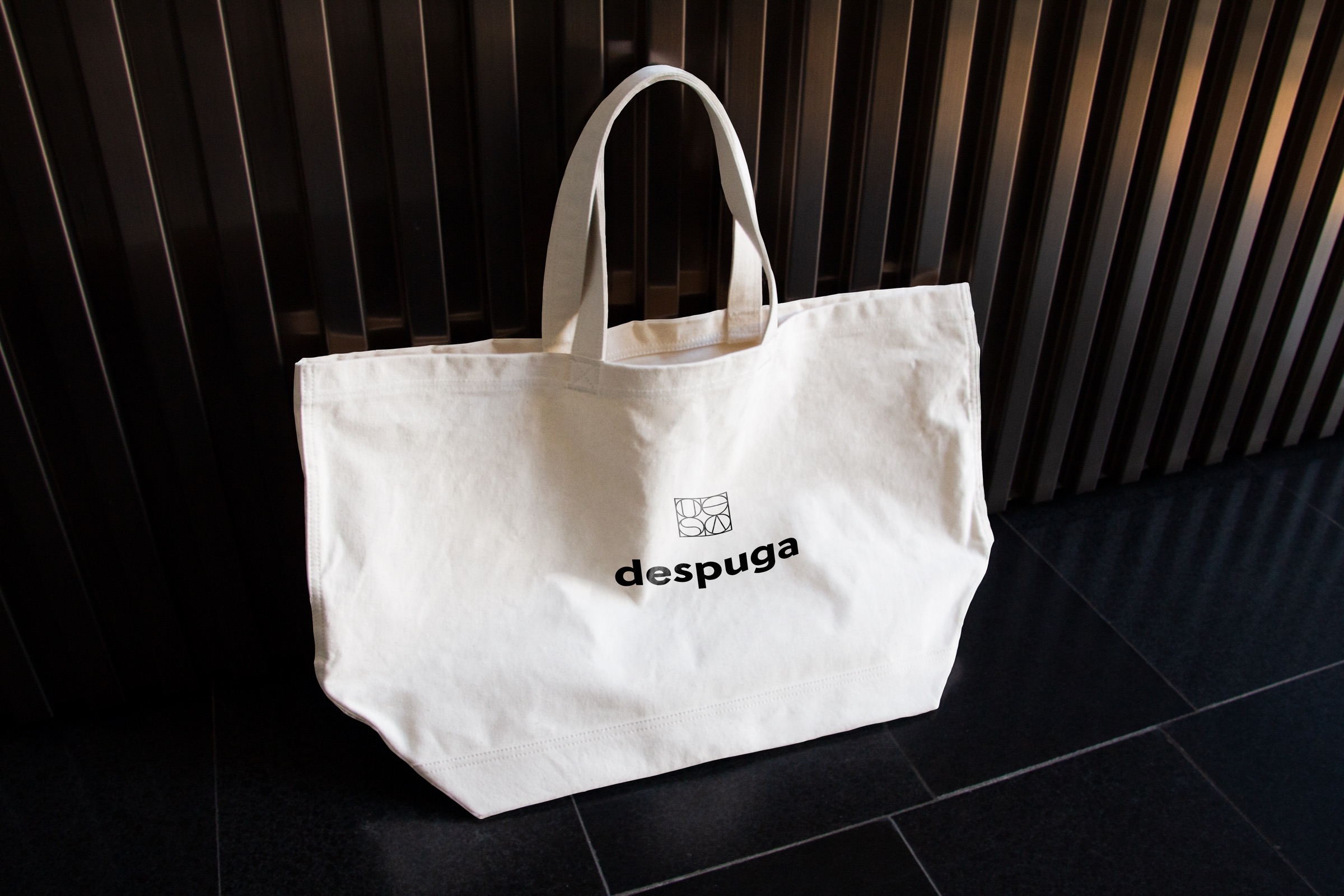
The sans-serif font was chosen for its simplicity and legibility, which are essential in today’s visually saturated digital landscape. The Despuga logo maintains its clarity and recognition across various platforms, whether displayed as a tiny social media avatar or a large billboard. This ensures that the brand remains sharp and distinct in all forms of visual communication.
3. Global and Digital Adaptability:
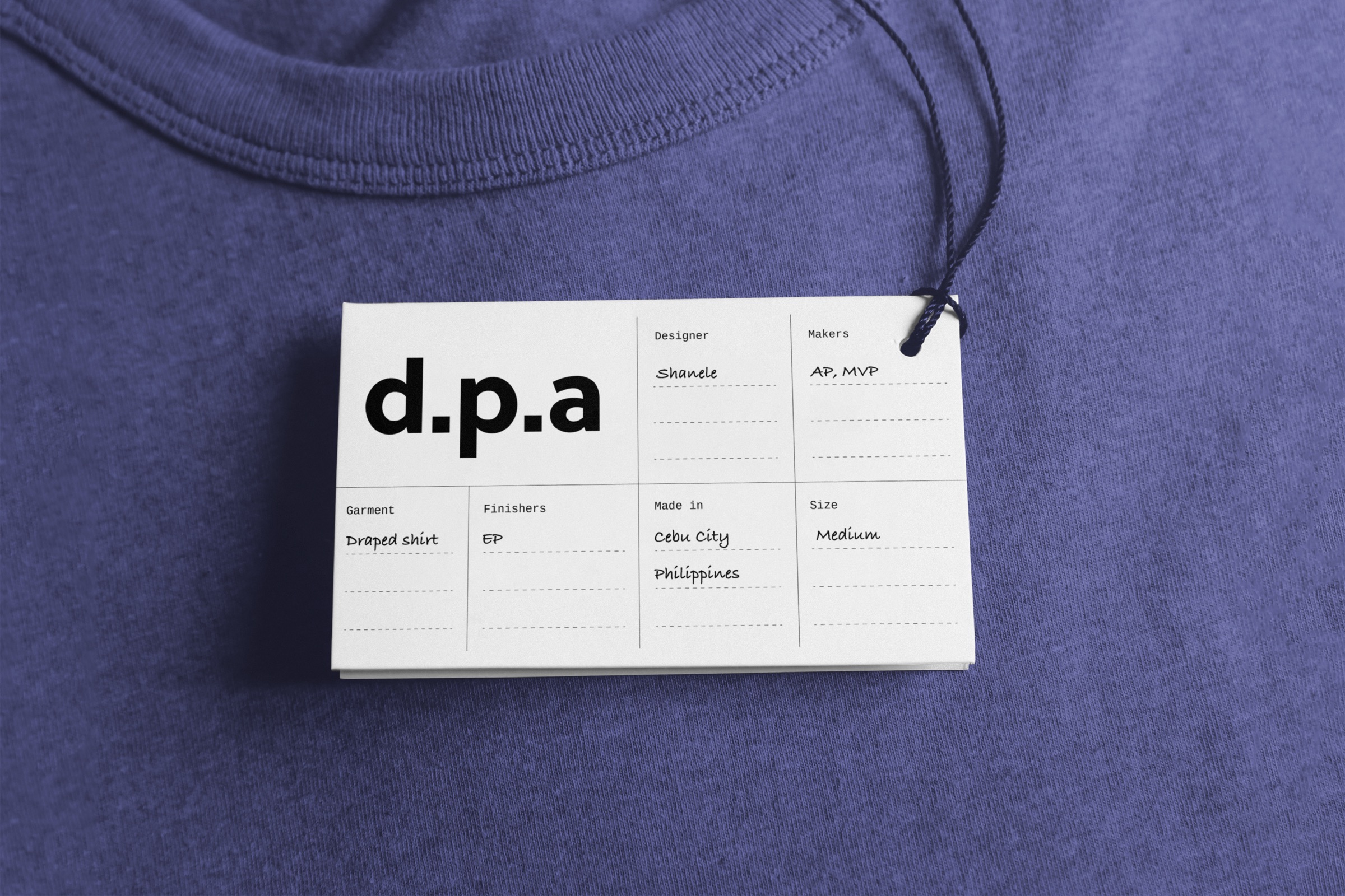
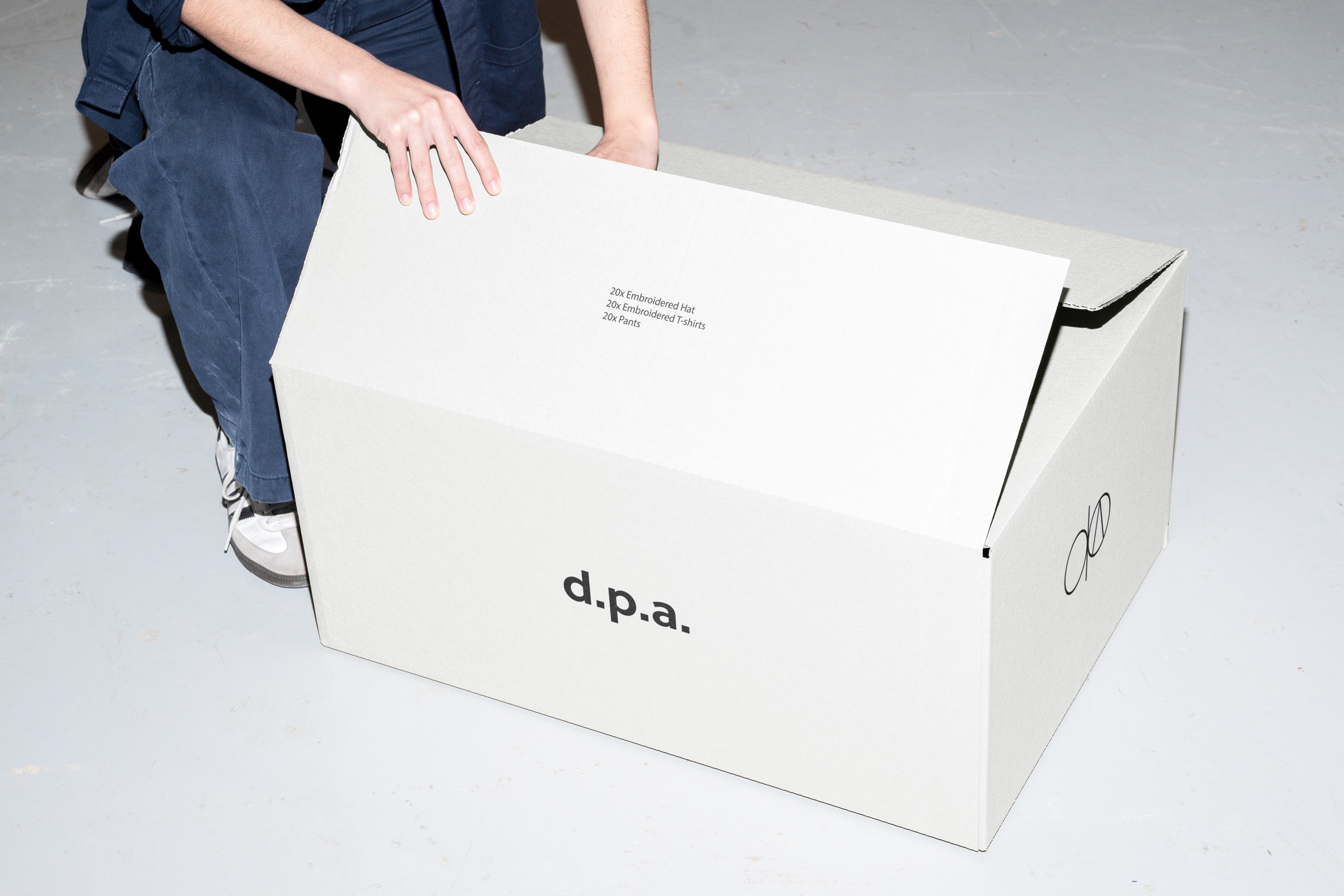
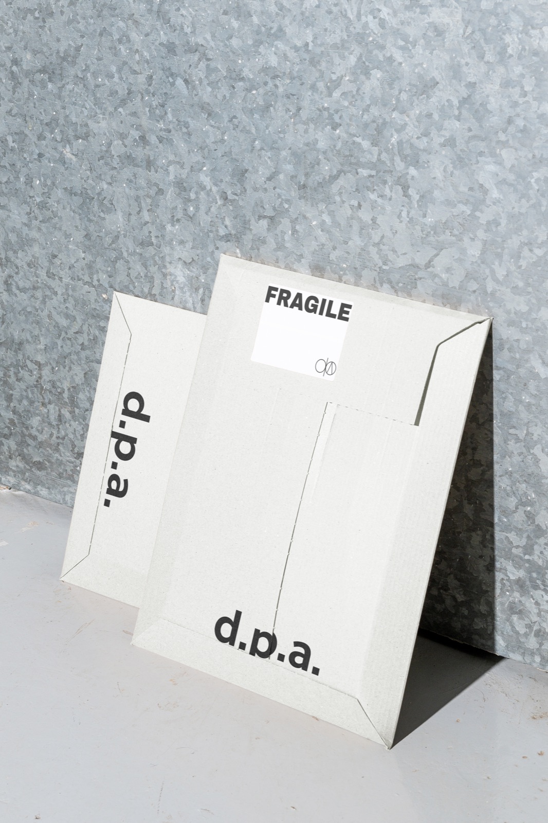
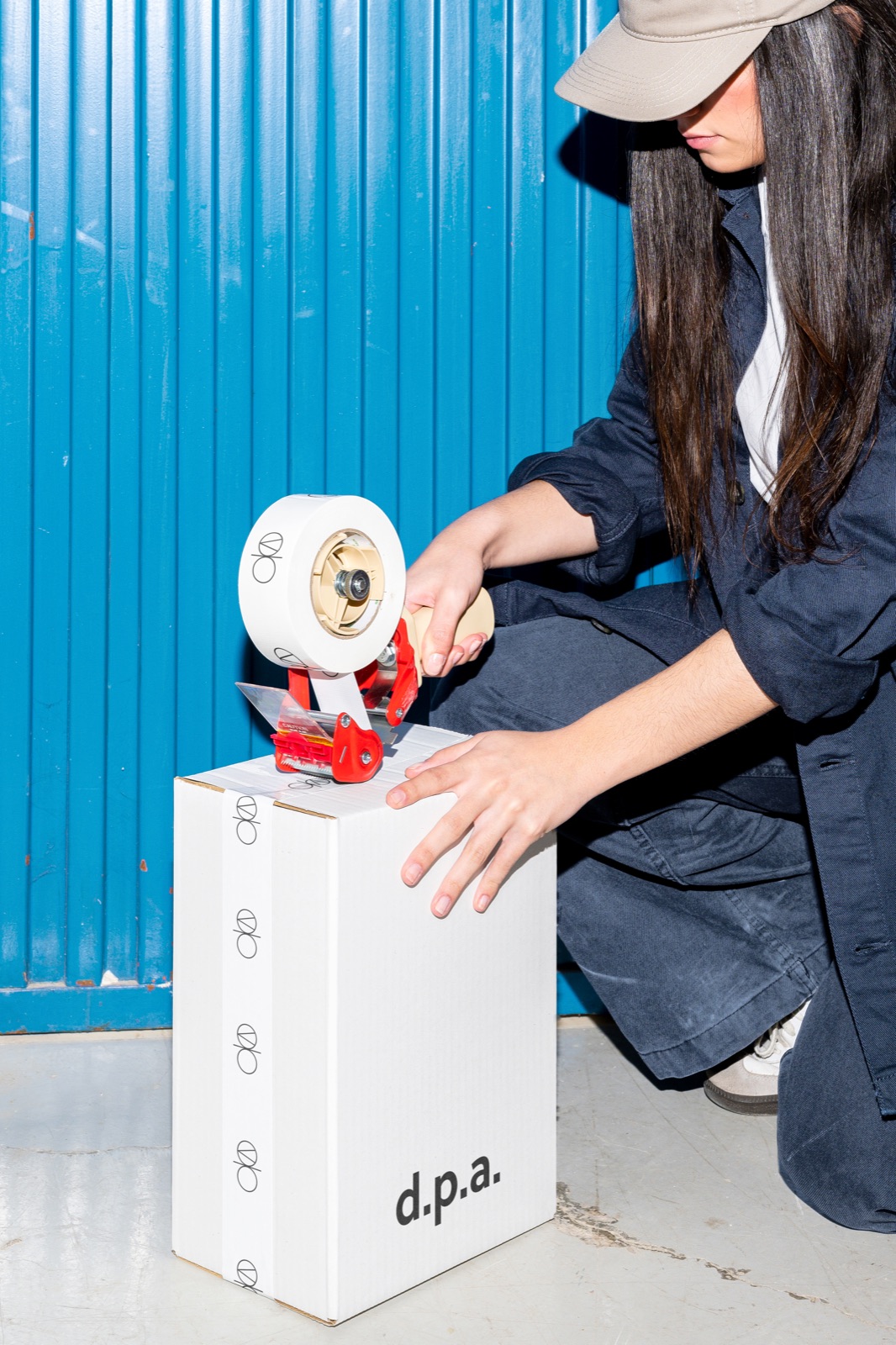
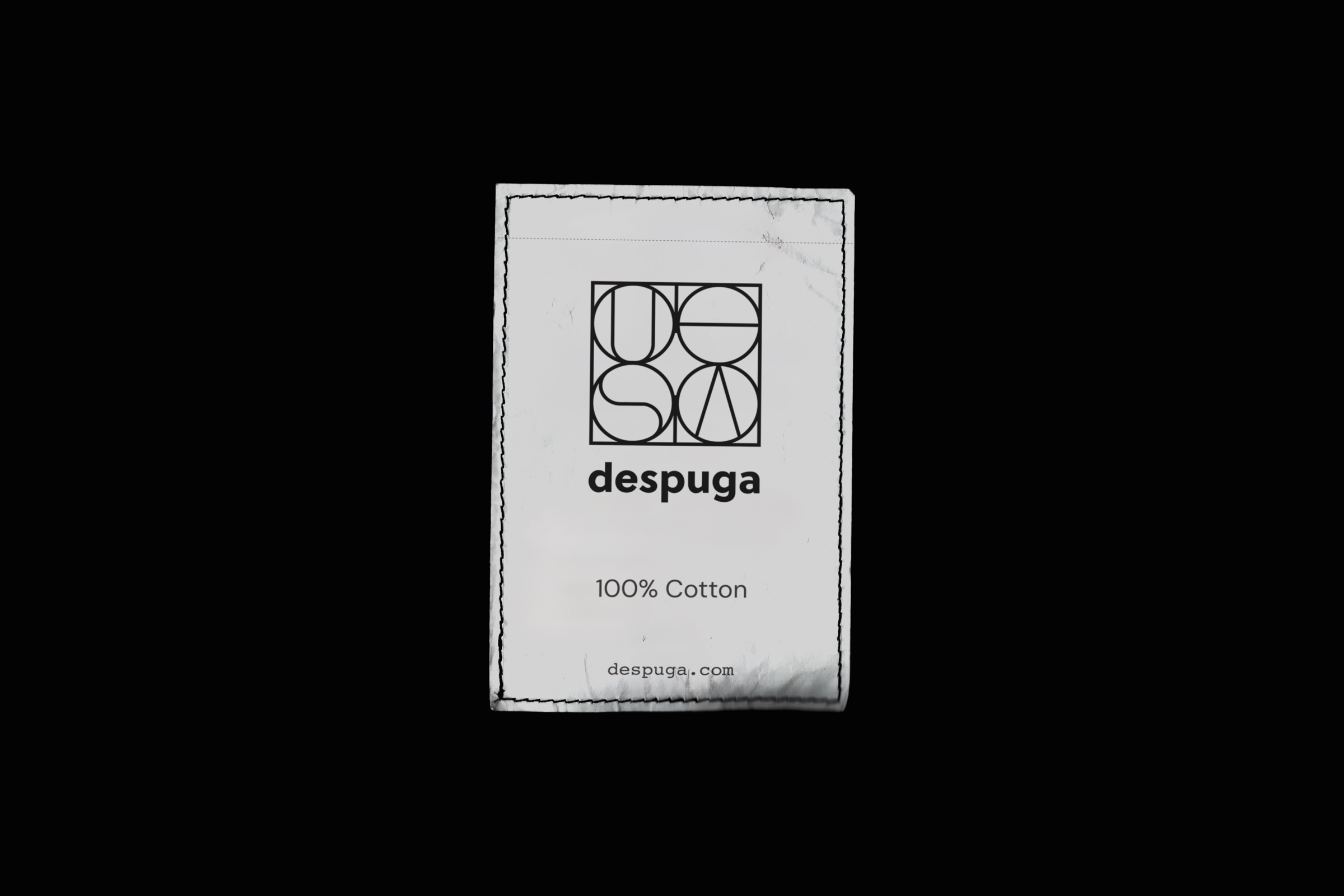
To enhance global recognition and ease of use in digital communication, the abbreviation of Despuga to DPA was incorporated into the logo design. This simplifies the brand’s representation, making it easier to type, share, and reproduce online. This change acknowledges the importance of a global, digital-first approach in modern branding, ensuring that Despuga is accessible and recognizable worldwide.
4. Minimalist Aesthetic:
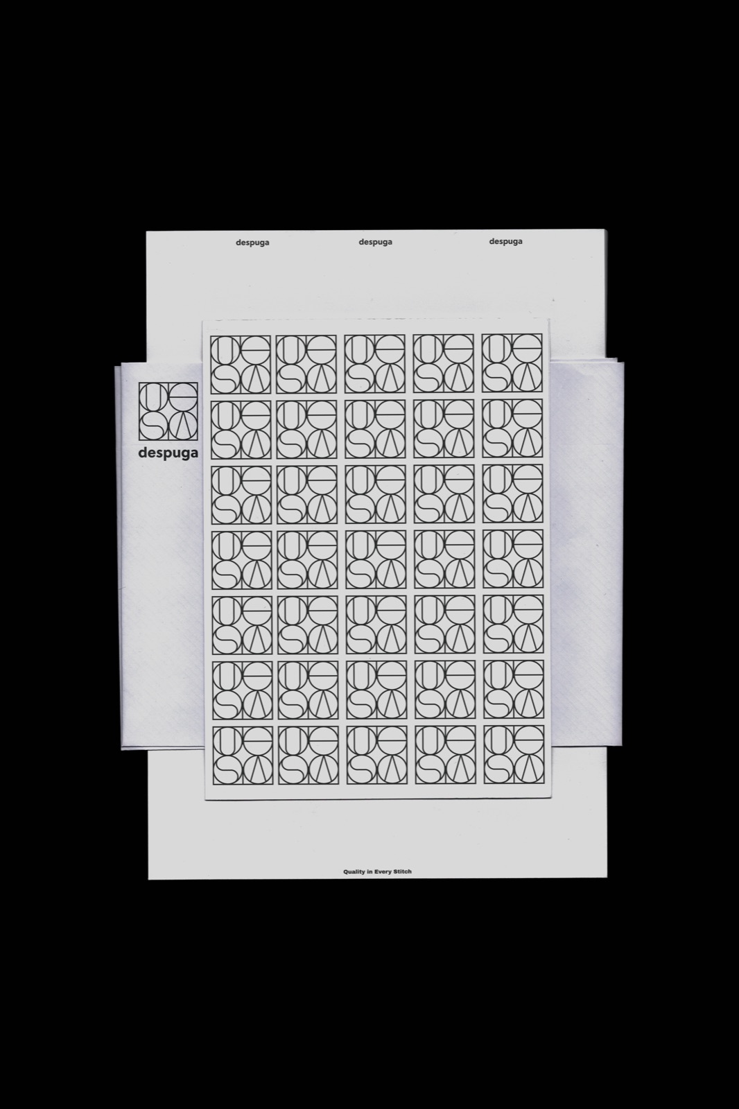
By adopting a sans-serif font, the Despuga logo reinforces a sleek, no-fuss aesthetic. This minimalist approach aligns with Despuga’s brand philosophy, which emphasizes quality in every stitch. The simplicity of the sans-serif font allows the logo to convey the brand’s dedication to excellence and meticulous craftsmanship without unnecessary embellishments.
5. Appeal to Younger Audience:
The modern, minimalist look of the sans-serif font is particularly appealing to younger, fashion-forward consumers. This demographic values contemporary design trends and prioritizes simplicity and clarity in brand aesthetics. The Despuga logo’s clean and modern design helps attract this audience, positioning the brand as relevant and desirable in a competitive market.
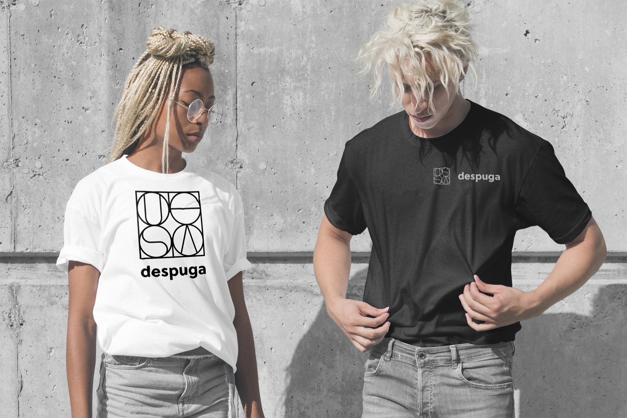
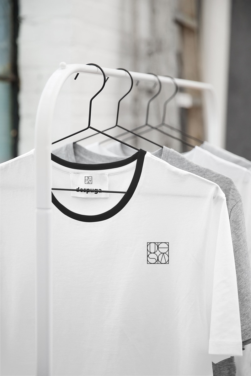
The Despuga logo, with its sans-serif font, successfully encapsulates the brand’s essence of quality, transparency, and community. It is a modern and versatile emblem that stands out in a crowded digital landscape, appealing to a global and youthful audience. This logo not only represents Despuga’s commitment to excellence but also ensures its relevance and recognition in today’s fast-paced, digitally-driven world.
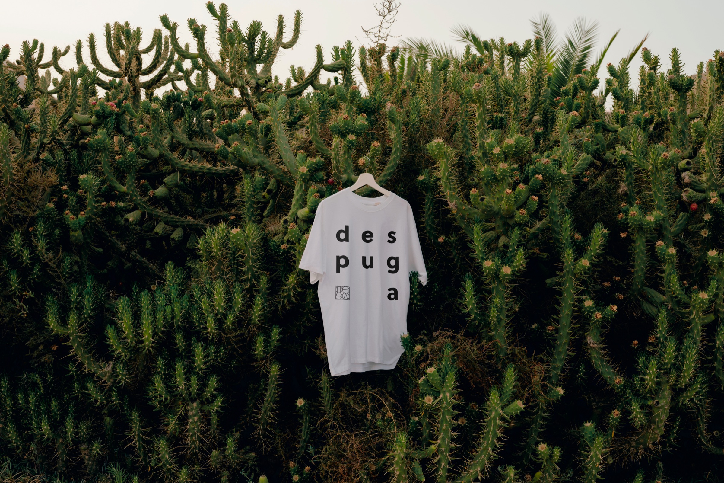
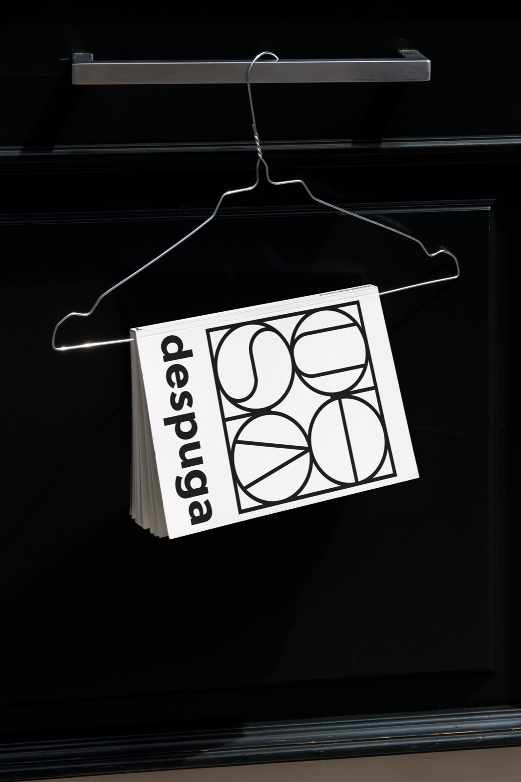
8. Color & typography
 despuga
Asul
Hero color
Despuga’s hero color, Asul, signifies stability and reliability, echoing our commitment to quality. Our mono typeface pays homage to traditional craftsmanship, ensuring consistent and clear brand communication.
Click any line to type your own words
Header
Sub-header
By focusing on these design explanations, we have crafted a logo that not only visually represents Despuga’s values but also strategically positions the brand for success in the global market.
Read more